What is a good design? And what makes a good design, really?
Many of us have a lot to say when it comes to designing. People would say a good design is something that is useful and for others, it should be functional.
The answers are actually infinite.
There are certain ideas and principles in creating a good design. Web developers and web designers need to think deeper into their projects to get the best results.

How about this?
What constitutes a good design?
The total package of a good design portrays a vital role. The first thing you should have in mind is: the message should be CLEAR. There is only one goal: the design should emphasize the message.
“You can design and create, and build the most wonderful place in the world. But it takes people to make the dream a reality.” — Walt Disney
A good design gives information and communicates an appropriate idea. Having a poor design dematerialize the communication by breaking the correct information.
There are principles of design that become handy to format the elements of design such as color, shape, texture, among others.
To sum up, these ideas must be taken into consideration:
- Clearly conveys ideas and information
- Emphasizes the message
- Follows the basic principles of design
Principles of a Good Design
With the right combination of design principles and aesthetic, there is no reason that your design will be a rubbish! It is important to know these principles.
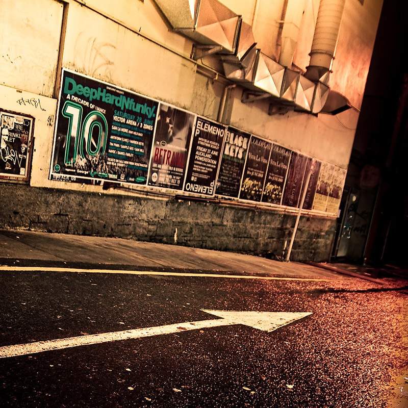
Image from Flickr
Direction
In creating something it is necessary to have a sense of direction. Direction tells you to move and aim for something and which gives the process fluidity.When all necessary things are in one direction, there is arrangement and focus that help the viewer see the emphasis of your designs.
Space
As important as emphasis, many designers overlook space. Without space, your design more likely would fail. It is considered one of the important elements of design. It is also sometimes called the “white space”.
Image from Flickr
Balance
Balance is how every elements of a design neutralize each other. With balance, design elements are organized in a manner to create the whole idea in its equilibrium.
Proportion
A good proportion maintains the cohesive connection of parts in relation to its entire body. It’s how each element works with other elements. It is the connectivity.
Minimalism
You can relate this to the minimalist point of view. Designers nowadays are now embracing the flat design because it looks clear and simple that allows them to focus on the content and the message.
Contrast
By using contrast you can generate variety. Combining all the artistic elements of web design brings appealing and great output. Balance and proportion projects coherence. On the other hand, contrast gives interest.
Emphasis
Giving an emphasis to your design gives a sense of clarity. When design elements are arranged in levels to create hierarchy of visual importance, this is emphasis.
Colors
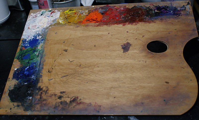
Image from Flickr
A perfect choice of color palette can enhance any user experience. Having a suitable color combination helps in creating balance and harmony. Colors projects a certain mood and emotion and should be used minimally.
Loading Time
Of course, almost everyone really doesn’t like a website that loads too long. It eats up their time. Effective optimization processes such as image sizing should be taken into consideration. Combining codes into a central CSS file can reduce HTTP requests.
Understanding these principles make one designer an effective and productive one.
According to Dieter Rams’ “10 Principles of “Good Design”, a good design is:
- Innovative
- Makes a product useful
- Aesthetic
- Product understandable
- Unobtrusive
- Serve as functional tools
- Honest
- Long-lasting
- Thorough down to the last detail
- Environmentally-friendly
- Should have less design as possible

Image from Flickr
Here are some helpful sites and tips to develop your skills in web design.
- WMueller.com
- Color Matters
- Code HS
- Code School
- Coursera
- CSS-Tricks
- KillerPHP
- Lynda
- Net Magazine
- Open Learn
- Skill Feed
- Quackit
- P2PU
- TreeHouse
- Smashing Magazine
A good design is not always based on how it looks. You should also have to see its ability to perform, to astonish, and to serve its purpose.
Typography

Image from Flickr
Typography, according to About.com, is the design and use of typefaces as means of communication.Typography uses typefaces and the white space around and through them to create a whole design.
Typography encompasses everything from calligraphy through digital type and type on web pages. There is richness in design for web designers who use letters as part of their designs.
Bad typography in your website can affects viewing span. It distracts readers, making them turn away and become uninterested.
Viewers usually take most of their time in a certain website because of its quality and effectiveness to deliver messages and ideas. So it is important to consider some symptoms of a poor web design output.
Symptoms of a Bad Web Design
Image from Flickr
Sometimes web designers do not know that some little details can affect their design aesthetic in relation to creating a website.
According to Nielsen Norman Group, some elements are unconsciously disregarded by web designers.
More Insights!
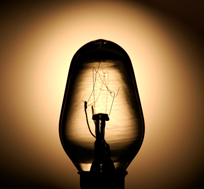
Image from Flickr
1. Poor Contrast
New visitors usually come to visit websites with fresh eyes. They don’t know where they eyes lead to. Having good contrast leads the viewers to their specific needs the time they enter a specific websites.
2. Navigational Failure
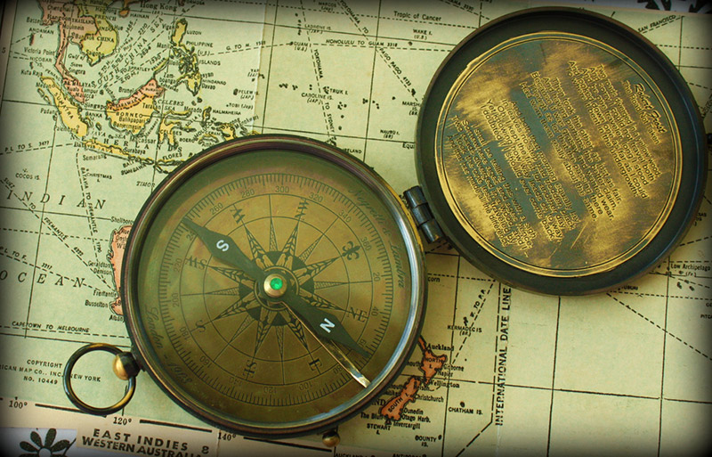
Image from Flickr
Navigation must be simple and consistent for everyone.
Common mistakes usually include:
- Different types of navigation on the same site
- Poorly worded links which makes visitors become lost if they click on anything on the page.
- No links back to the homepage
- Confusing links to the home page
3. Lacks Valuable Content
One serious problem about website design is the inability to deliver direct and interesting information. An updated content is very necessary. Try to think about this question always before you start something: Does your content solve your customers’ problems or does it create problems?
4. Don’t Use Graphics as Text
Don’t use graphics or Flash for text. No more, no less.
Reasons why:
- It increases the page size.
- It is not search engine-friendly.
- The graphics are often of poor quality.
- The mistakes are hard to correct.
5. Don’t Use Small Text
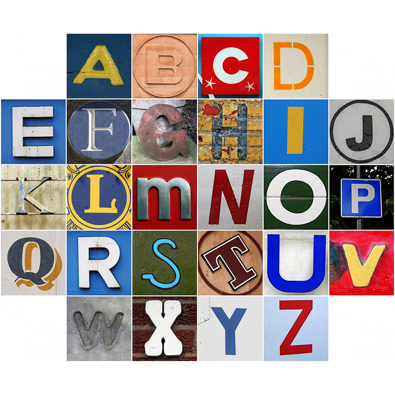
Image from Flickr
Designers usually are fond of playing with their designs using small text. Older people often have trouble looking at websites with small fonts. If viewers can’t see it, they will flee it.
What viewers WANT for a website?

Image from Flickr
People basically visit a website to satisfy their need and want. Considering these might be helpful.
- They want/need helpful information.
- They want/need to buy something.
- They want/need to make a valuable donation.
- They want/need to be entertained.
- They want/need to be part of a social community.

Image from Flickr
To Conclude
Generally, web designers create visual solutions to communications problems. They have interpretative and conceptual skills to share information. They use different styles and ways to achieve results based on color, typography, illustration, photography, animation, layout, and media.
As web designers, you should know how to use the principles of design to communicate a message and present data. What is your design principle?


No Comments