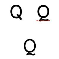
 Courier is a universal standard, resisting an immediate link to a single industry. Whether used in a budding scriptwriter’s manuscript, a coder’s preferred IDE, or a student’s desperately-lengthened essay written only hours before a due date, it is likely that you have seen and used Courier before.
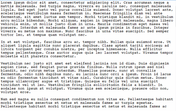
Courier New is by far the most popular variant of the world’s favourite monospace typeface, and for good reason: it is the version included in both Windows and Mac OS X, and it is the only version available in a word processor. We round up three free versions of Courier, all of which can be used to spice up your working environment right now. While all three are highly-polished fonts, our goal is not necessarily to find a ‘best’ font, but one which conforms most closely to Courier New’s metrics.
Courier for the People
Despite the long name, Courier for the People (CFTP)’s own mission statement gives clear insight into its goal: “Courier. Just better.” Consider it a remastered version of the font intended to right the perceived wrongs of Courier New, and you’re not far off the mark. Immediately, the font is thicker and more inviting on-screen. Though it takes some time to notice, the pagination is identical to traditional versions of Courier too, meaning it should be acceptable in professional environments.

As the creators themselves affirm, the font comes with a true italic, unlike the core fonts in the two major operating systems. Better yet is the fact the font’s designer is relaxed about usage of the font, professing that he “doesn’t care what you do with it.” It comes as a surprise given the highly professional and polished websites that most font foundries have for themselves, and is rather inviting compared to long streams of legalese about appropriate usage of the chosen font.
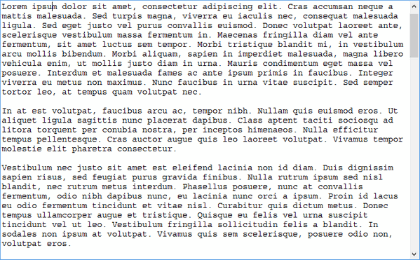
Dark Courier
A font with something of a history, and originally distributed by Hewlett-Packard many years ago. Dark Courier’s main goal was to make Courier New more readable by making it heavier and darker on the page. The slightly darker font gives greater readability on account of the fact that it contrasts with the stark white background of a page more readily.

Whereas CFTP sought to reinvent Courier in its own “improved” fashion, Dark Courier does not take the same approach. It is purely a darkened version of the now-ubiquitous Courier New, and so comes with the same foibles, including its forebear’s lack of a true italic style. While font designers may be disappointed by this, it is perhaps the most faithful font with regards to following original Courier styling. Writer Roland Stroud has expressed a similar feeling about Dark Courier, rating it above all other variants he tested in a nine-page essay written in 2009. Thus, it is arguably the best font for anyone seeking to improve upon Courier New in the most subtle way possible.
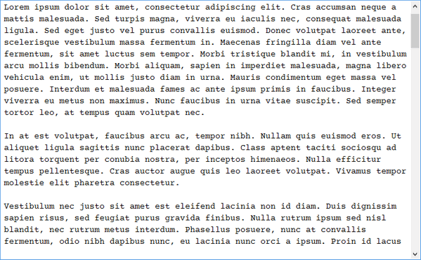
Courier Prime
Courier Prime is the result of work for Quote-Unquote Apps. Given founder John August’s work as a screenwriter, Prime’s goal was to better suit this purpose. Nevertheless, it is an incredibly pleasant font to work with, and also totally free. Like Courier for the People, Prime features a true italic, but differs most from the standard Courier New appearance. Therefore, it may not be for sticklers for tradition – which, of course, is totally fine.

Not only is Prime free to download and use, it is also the default font in the Fountain screenplay editor (which is exclusive to the Mac). Therefore, those who have dabbled in this creative field may already have some knowledge of Courier Prime, and what it does differently from its competition. While we at Make Tech Easier like Prime, and would have difficulty picking a preferred free variant of the font, we confess that Prime does not seem to conform to the same spacing and guidelines as Courier New; given that our goal was to conform to Courier New’s standard, it may not be a perfect substitute, but would certainly suit as a complete replacement.
Which should I use?
All three fonts look attractive on-screen, but Dark Courier emerges as our clear winner with regards to conforming to Courier New’s presence on-screen. It really is just a darker version of the existing font, which we see no issue with. This does not mean the other two fonts should be sidelined, simply that they are perhaps slightly less subtle twists on the classic Courier New. All three fonts are totally free to use, and as such, there is little reason to relegate yourself to only trying one.
The post Three Free Fonts to Spice Up Courier appeared first on Make Tech Easier.
![]()


No Comments