Last week we published a post looking at some of the world’s best ecommerce checkouts to see what we could learn from them.
They came from a range of industries, though they all sell consumer goods such as clothes or electronics.
One of the commenters noted that it would be useful to take a more targeted look at other industries, such asutilities, banking or insurance.
By coincidence, I’m in need of a new contents insurance policy so thought I’d murder two birds with one stone by reviewing the checkouts as I shopped around for quotes.
The criteria used by Econsultancy editor Graham Charlton are as follows. They’ll need to be modified slightly:
- Speed. Slow loading times are to be avoided.
- No forced registration. This is really unavoidable for insurance products, as providers need to know details of who they’re covering.
- Security reassurances. Trustmarks help to reassure customers who might be wary of buying online.
- Easy form filling. This is particularly important for insurance companies, as customers have to enter a lot of personal information.
- Progress indicators. Customers need to know how many more stages they have left otherwise they may get bored and drop out.
- Persistent basket summary. Remind users of the contents of their baskets and the total cost of the order so they don’t have to leave the checkout for this information.
- Remove distractions. The checkout should be enclosed so that users can’t be distracted and click elsewhere.
As a lazy consumer I’ll analyse those brands that appear most prominently in a Google search for ‘content insurance’, excluding comparison sites.
Which leaves us with these five…
Halifax
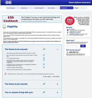
Halifax’s website has a retro feel to it, with tiny text fields and radio buttons, no date lookup tool, a tiny font and no neat UX features.
Focusing specifically on the checkout, it does have progress indicators but that’s about the only thing in its favour.
The most prominent graphics on the screen are two cashback offers if I buy buildings insurance at the same time. Unfortunately for Halifax I don’t need buildings insurance so it’s an irritating and pointless distraction.
And there’s nothing to really signpost the next stage or guide the user through the process as it’s all the same mix of white and blue.
Click to enlarge
Neither are there any security reassurances so customers are comfortable making a purchase – though presumably Halifax feels that its brand name infers a certain level of trust and security.
The payment options screen is slightly better as it spells out the overall and monthly payments in simple terms, but it persists with the annoying cashback offer.
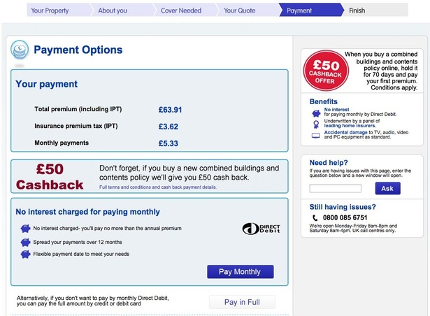
The final page does at least have a consistent design, but the tiny font and text fields means it offers a poor UX.
Direct Line
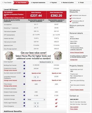
Direct Line’s forms have a less cluttered feel than Halifax, although the fields would benefit from being a but larger.
The summary page is also an improvement as it allows you to compare different options side-by-side.
Click to enlarge
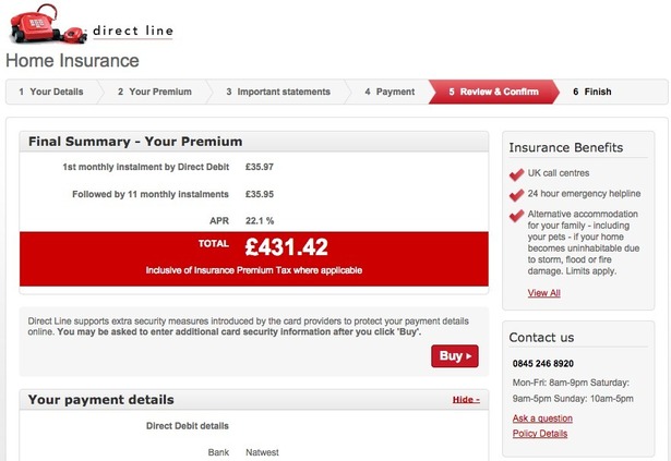
The final page gives an excellent summary, including all details of the policy and my personal details.
The price is clearly highlighted at the top of the screen, and there is a bold red CTA, though this does blend in slightly with the rest of the colour scheme.
Aviva
From the outset Aviva’s application offers an excellent UX in terms of form design.
It’s built using responsive design so all the buttons and text fields are huge to account for people using a mobile screen. This means everything is neatly spaced out and easy to click.
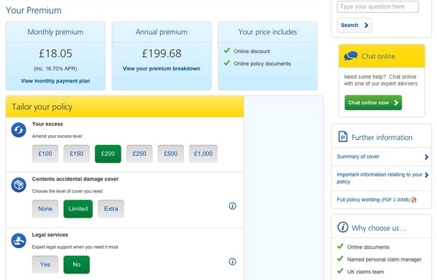
Once you receive the initial quote Aviva has a really useful tool that enables users to tailor their policy by adding or removing different elements.
Neither Halifax nor Direct Line offered this feature (which seems like an no-brainer), so there was no simple way of altering a quote.
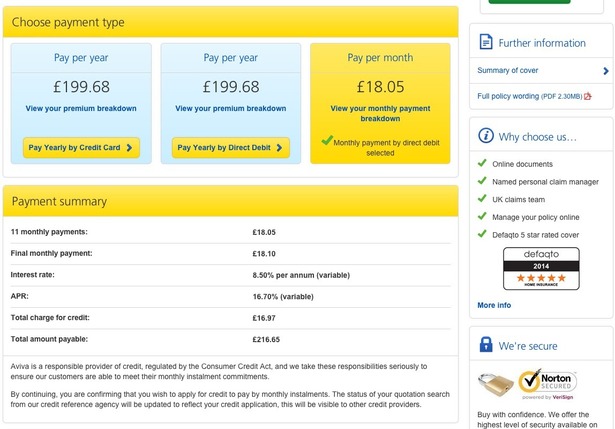
Looking specifically at the checkout, the three payment options are clearly displayed beneath a summary of the policy details, which are housed in dropdown menus to save space.
Payment is then a simple one-step process of entering bank account details before pressing ‘Buy now’.
The screen includes security symbols and thankfully doesn’t persist in trying to cross-sell irrelevant products.
Hiscox
In my mind the Hiscox brand is about prestige and heritage, and those values certainly come across in its outdated web forms.
Though it does use a number of neat features (such as automatic pop ups with information on how to fill in each field), and includes several security symbols, the layout and small text fields would benefit from being revamped.
At the checkout the security symbols are prominently displayed and the design is consistent with the rest of the application process, meaning it’s cluttered and difficult to read.
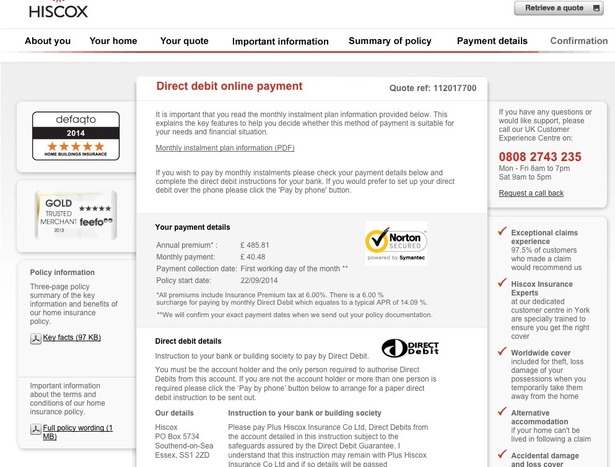
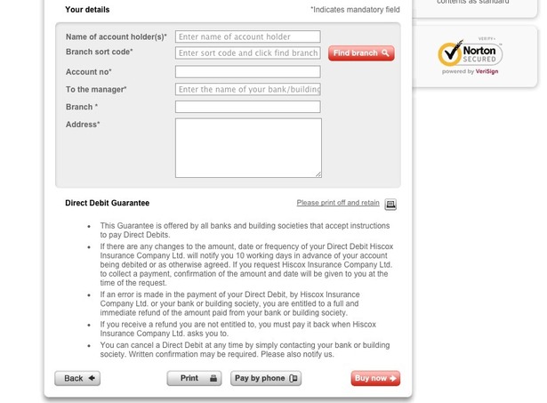
When setting up a direct debit Hiscox requires a lot of information relative to the other brands, asking for your branch name and address, as well as a message ‘To the manager’.
It’s only a couple of additional fields but it does all feel a bit unnecessary.
Tesco
Tesco has also opted for a small font and tiny text fields, however the layout and spacing is such that it retains a clean, uncluttered feel.
It has also remembered to include security symbols and includes a useful policy summary that is fixed on the screen as you scroll up and down.
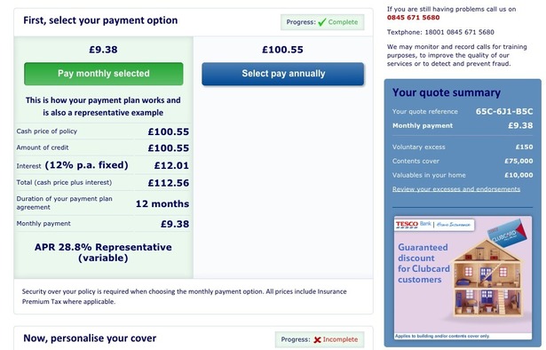
Tesco also has the option to tailor a quote at the summary screen by adding and removing different elements, but unfortunately it doesn’t automatically update.
This means users have to manually refresh the page after adding each different type of cover to see how it impacts the quote.
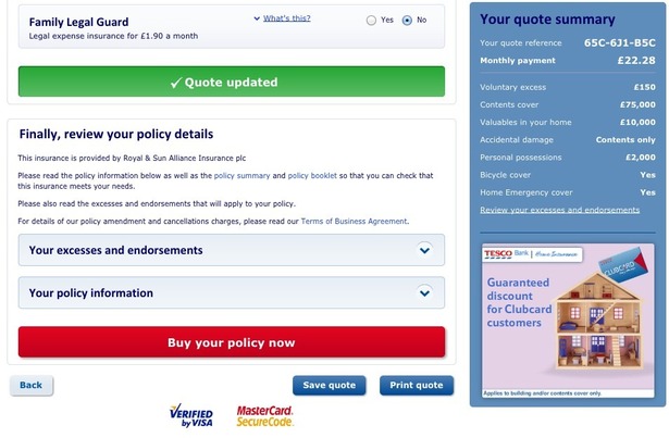
Once the customer is happy with a quote, the big red CTA leaves them in no doubt of the next stage.
At the checkout stage Tesco informs users that there will be three pages before the transaction is complete, which is a good way to reduce the likelihood of abandonment.
It also has a good policy summary and several security symbols to reassure customers.
The font and radio buttons are still a bit too small for my liking, but overall Tesco provides a decent user experience.

In conclusion…
This clearly isn’t a comprehensive look at the insurance industry, but it does indicate that many providers need to update their websites to bring them inline with modern UX requirements.
Aviva deserves credit for offering an excellent UX, with the large fields, big buttons and simple summary making it easy to find a quote and buy insurance.
This is because it uses responsive design, so the developers have had to take mobile users into account when designing the interface.
If you contrast that to Halifax or Hiscox, it’s clear that these sites haven’t been updated in a while and perhaps don’t invest much in CRO.
Fiddly, cluttered forms are likely to cause potential customers to drop out of the buying process, and I was particularly irked by Halifax’s constant attempts to cross-sell irrelevant products.
Though cross selling can be a very effective tactic, it was out of place in this instance and was far too prominent on the screen.
On the plus side, it should be pointed out that all the brands I looked at included a progress bar and a telephone number in case shoppers wanted to speak to someone.







No Comments