1. Getting Started
When you first turn on your watch, naturally you’re presented with a watch face. I will refer to this as your home screen. It’s the one you’re going to see the most, and it’s the background against which many cards will appear.
Android Wear provides a better way to view and interact with notifications than pulling out a smartphone time and time again. Thus, the UI is designed around switching between them. To do so, just swipe up and down. Swiping up will drag the next notification card onto the screen. Persistent swiping will continue to do so until there’s nothing new to see.
2. Notification Cards
To interact with any given card, tap on it. Depending on the item, this may or may not present additional information. In the case of Gmail, you can read the entire message on your watch. To interact with it, swipe from the right. When you swipe on the weather card, it presents a forecast of the next several days.
Swiping further to the right will present additional options one at a time. With messaging cards, you have the ability to reply or archive a message right from the watch. The last option is always to open the app on your phone instead.
Android Wear doesn’t have a keyboard, so if you want to reply to email, Hangouts, or text messages, you can only do so using voice dictation. As it turns out, speaking to your watch is a core part of the Android Wear experience.
3. Voice Commands And Opening Apps
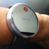
In effect, Google Voice Search serves as your app drawer replacement. You can access the screen by tapping once on your watch face – the home screen – or saying “OK Google.” Here you can then speak a command, such as “Show me my steps” (to pull up pedometer information) or “Set an alarm for 11AM.” If you want to see some of the commands that the watch can respond to, swipe from the bottom of the search screen. This will pull up a list of suggestions that you can remember or tap to open instead.
At the bottom of this list are your alarms, settings, and a “Start…” option that opens a list of your installed watch apps.
This list functions similarly to an app drawer. You swipe up and down to get to the app you want and then tap it to open.
To back out of any screen or get rid of a card, just swipe from the left. This will fling the page or item away and return you to the home screen.
4. Muting Alerts And Checking Battery Life
You can prevent your phone from vibrating and stop the display from lighting up by swiping down from the home screen. If you pull slowly, you will draw down a screen that displays the date and your watch’s battery life.
Conclusion
Once you get the feel of things, Android Wear is fairly easy to navigate, and it does a good job of keeping relevant information front and center. These are still early days for the platform, so there’s no telling just what elements will change in the future. In the meantime, a few things are already customizable. In part 2 of this series, we will take a look at how to change the default settings and tweak things to your liking.
The post How to Use Android Wear Part 1: Navigating the UI appeared first on Make Tech Easier.