The following is a guest post by Miguel Ángel Pérez. Miguel has been working on ways to transition pages on websites more gracefully. On single-page applications, we have more opportunity for this since we aren’t fighting the page reload. But traditional sites with page reloads, you can still be quite graceful with some help from CSS and JS. In this article Miguel focuses on setting up the CSS to do this and making it work with his plugin.
CSS animations (and a little JavaScript trickery) can let us add page transitions and move away from the hard-cut of page loads. My jQuery plugin smoothState.js helps polish those transitions and improve UI response times.
Page transitions benefit the user experience
Imagine, for a second, how disorienting it would be if touching a doorknob teleported you to the other side of the door. Navigating the web feels like using a teleporting doorknob. Layouts change, elements rearrange or disappear, and it takes time time for the user to adjust. Smooth transitions reduce the effort it takes for users to get settled into a new environment.
Native apps understand the importance of animations. It’s uncommon to find an app without page transitions, and users have grown accustomed to this higher level of usability. The web has started to feel outdated because of this shift in expectations. Many think of the web as an inferior experience to apps. Luckily, it doesn’t have to be this way.
Add page transitions with CSS @keyframes animations
Let’s take a look at an example to see how we could start adding page transitions. In our demo layout we can see the white flashes and hard-cuts typical of web pages.
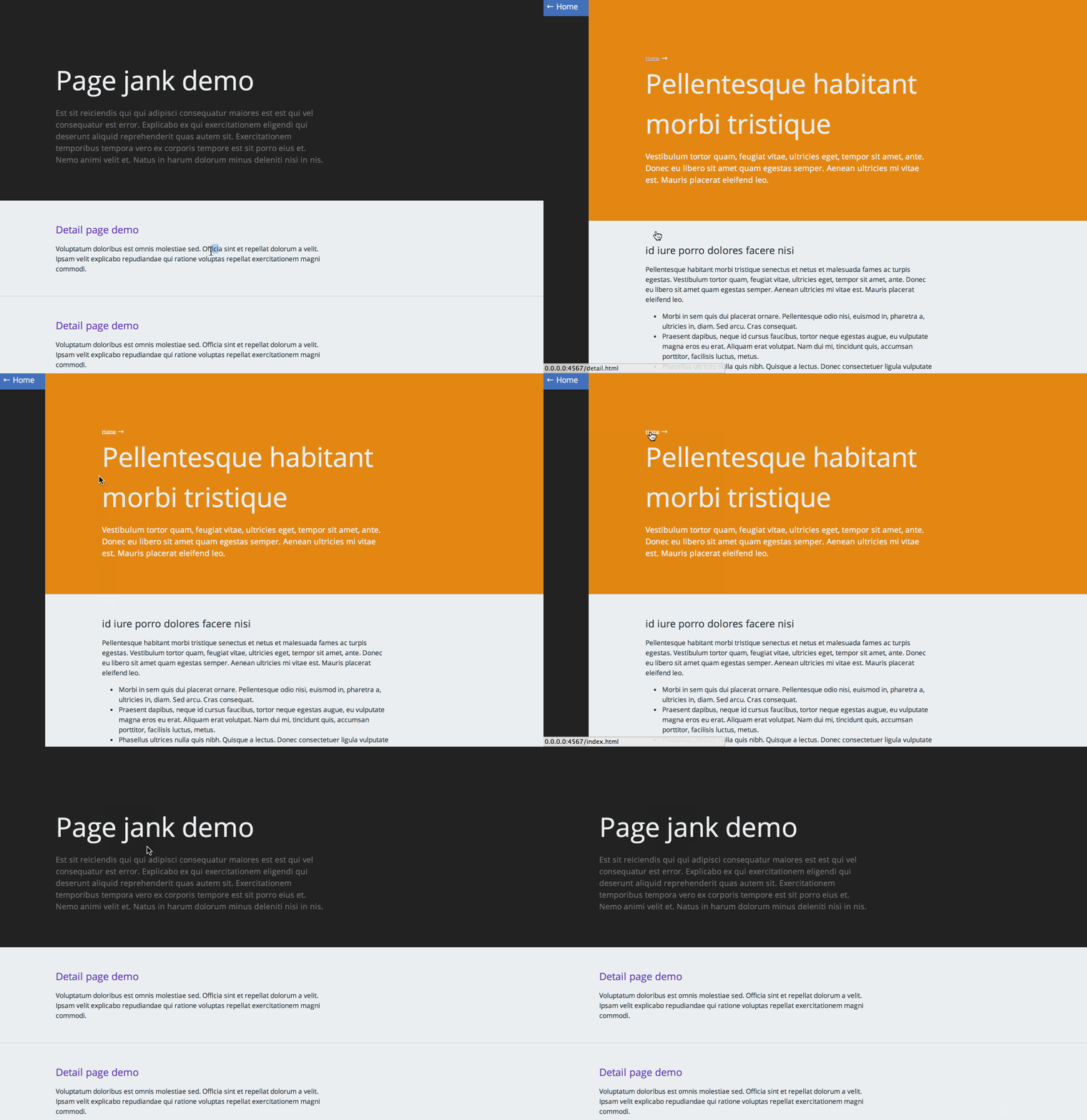
CSS animations allow us to define the visual behavior of an element when it gets rendered on the page. To add animations to our site we should:
- Identify how the elements on the page will animate
- Create the keyframes we’ll need
- Write the CSS declarations
- Add classes to the layout
Identify how the elements on the page will animate
Let’s look at our sample page:
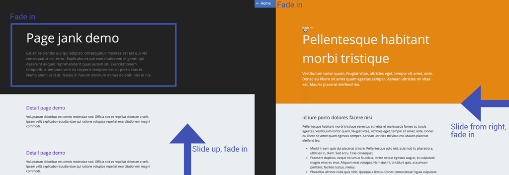
We can pick out a few opportunities for adding some transitions if we examine the layout. Google’s guide on meaningful transitions is a good set of rules for element animations. That’s a good place to start if you’re new to interaction design.
Create the @keyframes we’ll need
It looks like we’ll need three types of unique animations.
- A fade in animation for the header and the button
- A slide up animation with a slight fade for the contents of the home page
- A slide in from the right, with a slight fade, for the contents of the detail page
Let’s create those CSS @keyframes and name them:
/*
 * Keyframes
 */

@keyframes fadeIn {
  0% {
    opacity: 0;
  }

  100% {
    opacity: 1;
  }
}

@keyframes fadeInUp {
  0% {
    opacity: 0;
    transform: translate3d(0, 100%, 0);
  }

  100% {
    opacity: 1;
    transform: none;
  }
}

@keyframes fadeInRight {
  0% {
    opacity: 0;
    transform: translate3d(100%, 0, 0);
  }

  100% {
    opacity: 1;
    transform: none;
  }
}

}
Write the CSS declarations
Now that we have our keyframes, we’ll need to attach them to classes using the CSS animation properties. Here’s what that CSS looks like:
/*
 * CSS Page Transitions
 * Don't forget to add vendor prefixes!
 */
.m-scene {
  /** Basic styles for an animated element */
  .scene_element {
    animation-duration: 0.25s;
    transition-timing-function: ease-in;
    animation-fill-mode: both;

  }

  /** An element that fades in */
  .scene_element--fadein {
    animation-name: fadeIn;
  }

  /** An element that fades in and slides up */
  .scene_element--fadeinup {
    animation-name: fadeInUp;
  }

  /** An element that fades in and slides from the right */
  .scene_element--fadeinright {
    animation-name: fadeInRight;
  }
}
It’s important to note that animations that take too long will annoy the user. There has been quite a bit of research around the usability of response times. To keep the UI feeling snappy limit the animation duration to 0.25 seconds. Run some quick and dirty user testing to make sure your animations don’t feel bothersome.
Add classes to the layout
Now that we have written out our CSS, it’s time to add the classes to the markup.
<!-- Home page -->
<div class="m-scene" id="main">
  <div class="m-header scene_element scene_element--fadein">
    ...
  </div>
  <div class="m-page scene_element scene_element--fadeinup">
    ...
  </div>
</div>
<!-- Detail page -->
<div class="m-scene" id="main">
<div class="m-aside scene_element scene_element--fadein">
...
</div>
<div class="m-right-panel m-page scene_element scene_element--fadeinright">
...
</div>
</div>Our result is a nicer entrance to the pages:
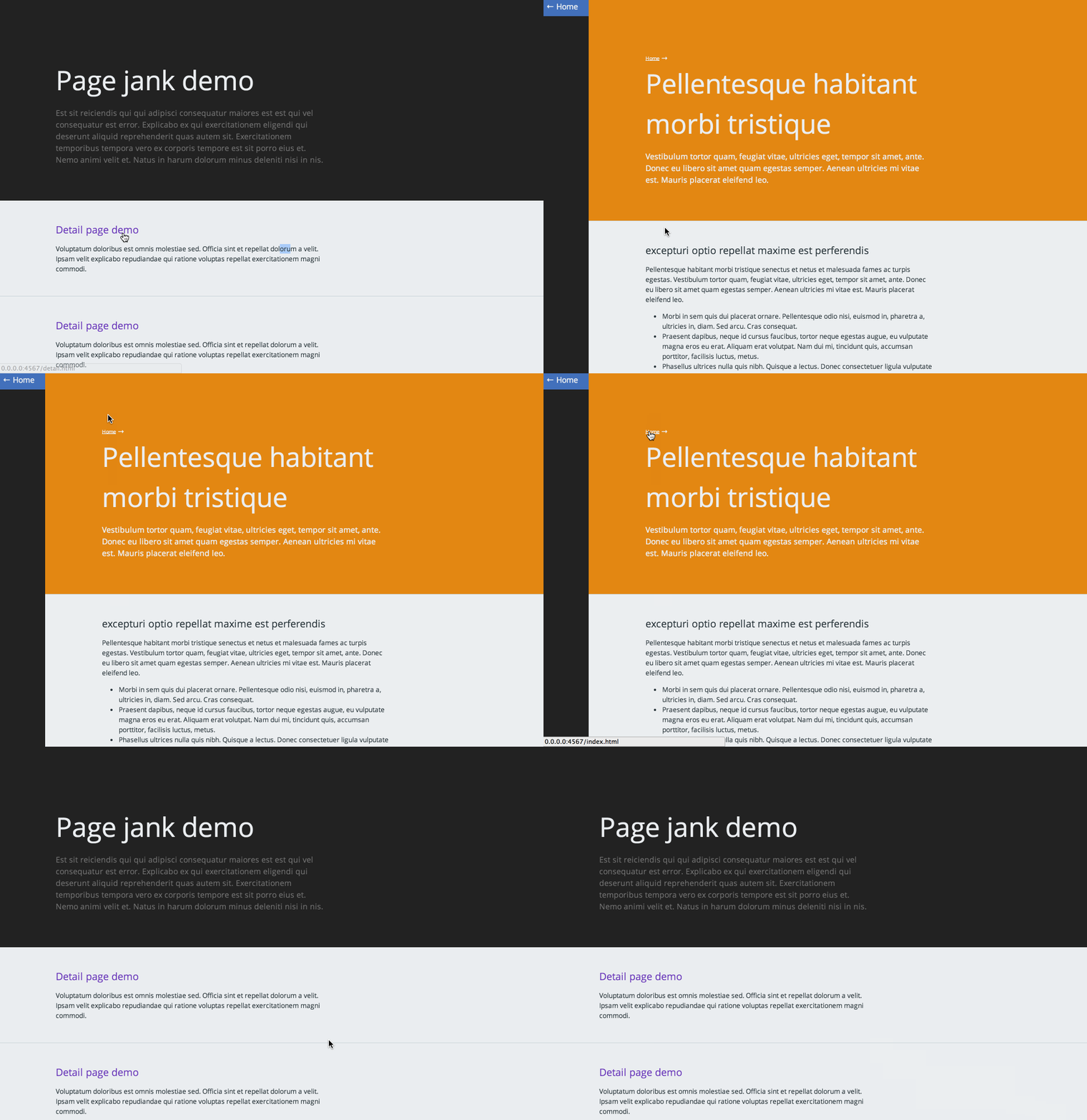
We’ve made some progress on our page with just CSS. But even with our improvements, we still see the flash and the animations aren’t as tight as they could be. Now we’ll use smoothState.js to fix that.
Adding polish with smoothState.js
smoothState.js is a jQuery plugin that progressively enhances page loads to give us more control over page transitions. To include it in our page we’ll need to:
- Grab a copy of jQuery and add it to our page
- Download smoothState.js and add it after jQuery.
- Create and include a new .js file, after smoothState.js, where we can run the plugin. (Or use whatever build tool / concatination process you use to do all this.)
Inside our new .js file, we’ll want to initialize smoothState on a container with an id. The container should wrap all the content on the page.
;(function ($) {
  'use strict';
  var content  = $('#main').smoothState({
        // onStart runs as soon as link has been activated
        onStart : {

          // Set the duration of our animation
          duration: 250,

          // Alterations to the page
          render: function () {

            // Quickly toggles a class and restarts css animations
            content.toggleAnimationClass('is-exiting');
          }
        }
      }).data('smoothState'); // makes public methods available
})(jQuery);
smoothState gives us access to an onStart.render() callback that allows us to choreograph the way elements exit the page. We can eliminate the page’s hard-cuts by reversing the layout animations before displaying new content. To do this, run the .toggleAnimationClass() function, passing in a class as the first argument. Now we’ll declare a new animation direction using that class.
/*
 * CSS Page Transitions
 * Don't forget to add vendor prefixes!
 */
.m-scene {
  .scene_element {
    animation-duration: 0.25s;
    transition-timing-function: ease-in;
    animation-fill-mode: both;

  }

  .scene_element--fadein {
    animation-name: fadeIn;
  }

  .scene_element--fadeinup {
    animation-name: fadeInUp;
  }

  .scene_element--fadeinright {
    animation-name: fadeInRight;
  }

  /** Reverse "exit" animations */
  &.is-exiting {
      .scene_element {
        animation-direction: alternate-reverse;
      }
  }
}
We’ll also want to animate the user back to the top of the page. Achieve this by using jQuery’s .animate() function and setting the scrollTop property to 0.
;(function ($) {
  'use strict';
  var $body    = $('html, body'), // Define jQuery collection
      content  = $('#main').smoothState({
        onStart : {
          duration: 250,
          render: function () {
            content.toggleAnimationClass('is-exiting');

            // Scroll user to the top
            $body.animate({ 'scrollTop': 0 });

          }
        }
      }).data('smoothState');
})(jQuery);
The final result is a smooth transition between the pages of our site. Elements enter and exit the page with grace and the white flash is gone. We’re firing the animations even before the content loads so the user sees an immediate response from the page.
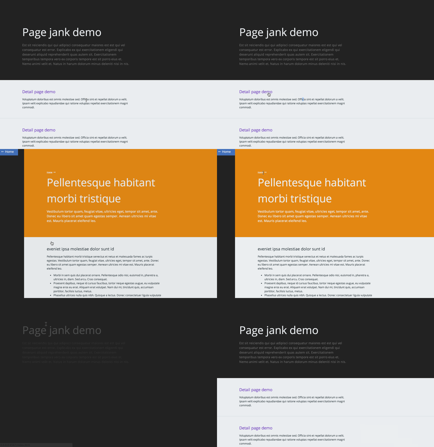
How To Add Page Transitions with CSS and smoothState.js is a post from CSS-Tricks






No Comments