Lucas Bebber’s Glitch is a super cool effect. It’s like you’re looking at some text displayed on a progressive scan monitor that has been dropped on the ground one too many times and so the alignment of the pixels is off in weirdly un-even amounts time and space.
It’s bonafide CSS trick if there ever was one! It took me a bit to figure out how it was working, so I thought I’d explain. Then I ended up making it work for other kinds of content as well as making it into a group of Sass @mixins to make working with it a bit easier.
See the Pen CSS Glitched Text by Lucas Bebber (@lbebber) on CodePen.
Three Copies of the Text
While the HTML is just:
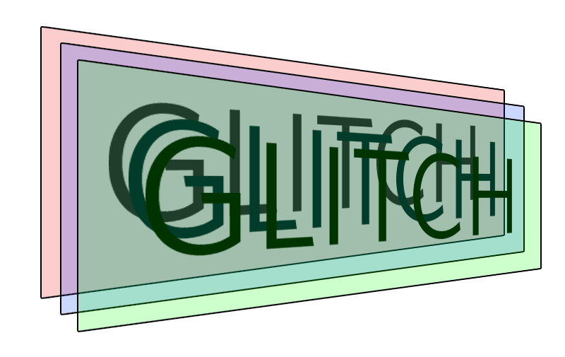
<div class="glitch" data-text="GLITCH">GLITCH</div> Three copies of it are created, via pseudo elements, and they are positioned right on top of each other.
.glitch {
  position: relative;
}
.glitch::before,
.glitch::after {
  content: attr(data-text);
  position: absolute;
  top: 0;
  left: 0;
  width: 100%;
  height: 100%;
}
Producing three unique copies that can be controlled individually:

Alter the Copies
Each copy is identical except that:
- It’s offset to the left or right
- It has a highlight, in the form of a text-shadow
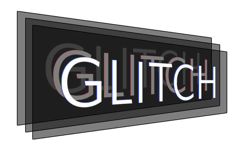
Between the offset and the highlight, it gives it that broken feeling.
.glitch::before {
  /* ... anything needed to make it identical */

  /* variation */
  left: 2px;
  text-shadow: -1px 0 red;

  /* important: opaque background masks the original */
  background: black;
}
.glitch::after {
  /* ... anything needed to make it identical */

  /* variation */
  left: -2px;
  text-shadow: -1px 0 blue;

  /* important: opaque background masks the original */
  background: black;
}
So now the three copies are like this:

Clipping the Copies
You’d only ever see the top copy if left as-is. Probably the ::after version, unless you alter with z-index. But never fear, we’re going to be only revealing parts of the top, altered copies with the clip property. This property is apparently deprecated in favor of clip-path, but at the time of this writing, only clip was working for me. I’m sure that will change in time, so we’ll have to keep an eye on it, and presumably Autoprefixer will handle it.
The syntax for clip is kinda weird. For the four values, you might expect something like top/left/width/height, or point-at-top-left/point-at-bottom-right. But instead it’s like margin and padding: top/right/bottom/left
.glitch::before {
  clip: rect(44px, 450px, 56px, 0);
  /*
    Essentially a box from 0, 44px
    to 450px, 56px
  */
}
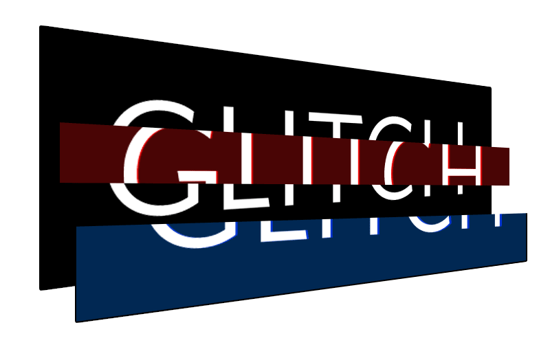
Here’s some example clips on those layers, now with fully opaque backgrounds applied (but still rotated and with extra colors so you can see what’s going on):

Animate the Clips
Turns out clip can be animated, so, that clipped box will animate to a new position over time if told to, Here’s an example of keyframes:
@keyframes glitch-anim {
  0% {
    clip: rect(70px, 450px, 76px, 0);
  }
  20% {
    clip: rect(29px, 450px, 16px, 0);
  }
  40% {
    clip: rect(76px, 450px, 3px, 0);
  }
  60% {
    clip: rect(42px, 450px, 78px, 0);
  }
  80% {
    clip: rect(15px, 450px, 13px, 0);
  }
  100% {
    clip: rect(53px, 450px, 5px, 0);
  }
}
Notice the left and right values remain the same, it’s just the top and bottom that change. And those values are kinda random.
You can generate that pretty easily with Sass, like:
@keyframes glitch-anim {
  $steps: 10;
  @for $i from 0 through $steps {
    #{percentage($i*(1/$steps))} {
      clip: rect(random(100)+px, 9999px, random(100)+px, 0);
    }
  }
}
Because you’d want two sets of randomized clipping positions, you’d make two sets of those @keyframes, and apply them to the copies:
.glitch::before {
  ...

  animation: glitch-anim-1 2s infinite linear alternate-reverse;
}

.glitch::after {
  ...

  animation: glitch-anim-2 2s infinite linear alternate-reverse;
}
There is where we set the speed (number of keyframes also affects speed) as well as making it run infinitely back and forth.
It’s pretty fun to watch:

Although it should go without saying a little goes a long way.
Sass @mixins
I thought it would be neat if the technique was more reusable. Basically call a @mixin with parameters to control the effect and get just what you need.
.example-one {
  font-size: 100px;
  @include textGlitch("example-one", 17, white, black, red, blue, 450, 115);
}
Here’s my take on it:
/*
  (TEXT) PARAMS
  =================
  1. Namespace
  2. Intensity
  3. Text color
  4. Background color (flat)
  5. Highlight #1 color
  6. Highlight #2 color
  7. Width (px)
  8. Height (px)
*/

@mixin textGlitch($name, $intensity, $textColor, $background, $highlightColor1, $highlightColor2, $width, $height) {

  color: $textColor;
  position: relative;
  $steps: $intensity;

  // Ensure the @keyframes are generated at the root level
  @at-root {
    // We need two different ones
    @for $i from 1 through 2 {
      @keyframes #{$name}-anim-#{$i} {
        @for $i from 0 through $steps {
          #{percentage($i*(1/$steps))} {
            clip: rect(
              random($height)+px,
              $width+px,
              random($height)+px,
              0
            );
          }
        }
      }
    }
  }
  &:before,
  &:after {
    content: attr(data-text);
    position: absolute;
    top: 0;
    left: 0;
    width: 100%;
    background: $background;
    clip: rect(0, 0, 0, 0);
  }
  &:after {
    left: 2px;
    text-shadow: -1px 0 $highlightColor1;
    animation: #{$name}-anim-1 2s infinite linear alternate-reverse;
  }
  &:before {
    left: -2px;
    text-shadow: 2px 0 $highlightColor2;
    animation: #{$name}-anim-2 3s infinite linear alternate-reverse;
  }

}
There are a million different ways to approach it, this is just one. Totally depends on how much you want the mixin to do for you, how much customizability you want or need, what you want left in the HTML, etc.
I also made two more mixins, one for applying this effect to images, and on for inline SVG. They are different, because they don’t use pseudo elements to make the copies, coloring happens in different ways, positioning happens differently, etc. Here’s all three of them together.
And a demo:
See the Pen CSS Glitched Text by Chris Coyier (@chriscoyier) on CodePen.
Glitch Effect on Text / Images / SVG is a post from CSS-Tricks


No Comments