Out of the 45 checkouts I filled on 17 September 2014, five days later as I write this there are only three basket abandonment emails sat in my inbox.
Retargeted display ads? Yeah loads of them…
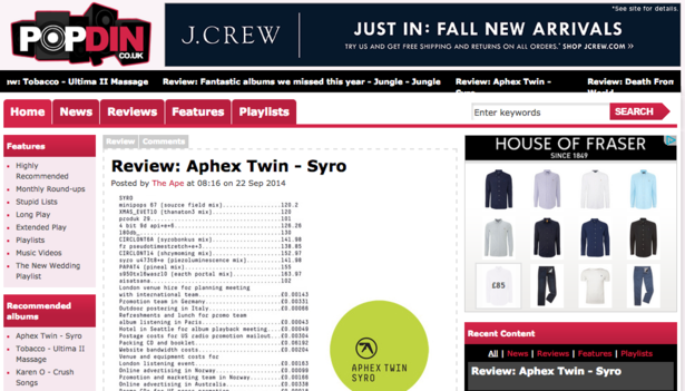
… but surprisingly few emails. Am I wrong to expect more than three? Are basket emails falling out of favour?
As I discovered earlier in the year whilst asking the question why should you be sending basket abandonment emails? according to eDigitalResearch and IMRG research 77% of online shoppers abandoned their baskets in 2013.
Imagine three-quarters of a high street shops’ customers getting to the till and suddenly changing their mind and leaving their baskets where they are.
This is a huge problem for online retail. So what can email marketers do to improve matters? Well, to be flip, sending some email reminders would be a good start. Perhaps things aren’t as easy as that though.
Best practice tips
Although emails sent immediately after abandonment may seem a little desperate, perhaps one sent within the first hour asking if you had technical difficulties or if something went wrong with the purchase would be helpful and certainly puts the customer first. Then later hit them with an explicit call-to-action.
Remember to be absolutely clear with your email subject lines. Let the visitor know exactly why they are being retargeted, therefore increasing the chance it won’t be ignored. You don’t want this to be lost amongst the marketing emails from other brands and even your own.
Include the abandoned items in the email. Use images of the items. Add links to the items. Also it might be worth adding scarcity to the email by revealing how many of the items are left in stock.
Draw attention to your site’s excellent returns policy, include deliver charges, you could even offer an exclusive discount on the items via the email if you feel this may be the reason for the initial abandonment.
Most importantly though, and this may appear obvious to some, do remember to include a link that goes directly to your checkout.
There are loads more best practice tips in Abandoned basket emails: creative vs. best practice, and using these let’s take a look at the three basket abandonment emails I received.
Currys
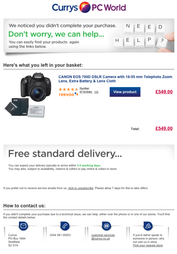
Currys was the keenest. I received this fairly soon after I left the site…
The good:
The subject line was obvious so I knew what to expect, I also like the friendliness of it: ‘Hi there, you left some items in your basket at currys.co.uk’, however I would say the front half dominates the subject and there’s a chance the important bit relating to the basket may be clipped early in some inboxes.
The abandoned product is shown clearly, with a strong link to its product page.
The benefit of free standard delivery is highlighted in the email, as is the price. There’s also a message at the bottom saying that if you didn’t complete your purchase due to a technical issue they can help with links to its various customer service channels.
The could-do better:
There is no direct link to the checkout, which is certainly a barrier to conversion. When you click on the ‘view product’ button, it takes you to the product page, however your basket no longer contains the item.
If the item is no longer available, then that’s a completely valid reason for them to empty your basket. However this should be communicated in the email, by saying ‘hurry there’s not much stock left’ or offering similar alternative products.
Lack of stock doesn’t seem to be the case here, so there’s no reason why it shouldn’t remain in the basket.
This is just a picky one, but the price has a link to the same product page as ‘view product’ which seems a bit pointless, and then the ‘total price’ isn’t actually a link to anything, although you’d assume otherwise.
House of Fraser
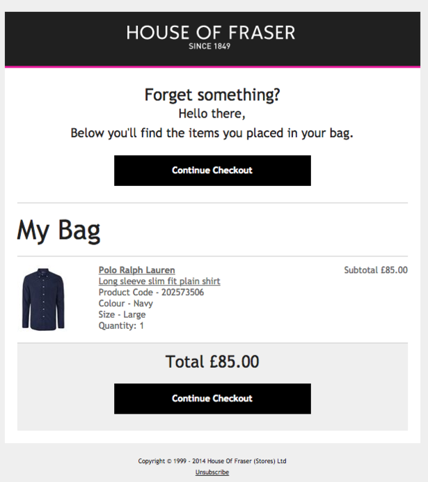
House of Fraser followed an hour later with this…
The good:
I like its elegance and simplicity. The huge ‘continue checkout’ is great, as is the fact that it goes straight to your abandoned basket and still contains your purchases.
The links to the product itself also go straight to the product page, with the item still remaining in the basket.
The subject line ‘Don’t forget your House of Fraser items’
The could-do-better:
House of Fraser offers free delivery, surely this could be included in the messaging for further enticement.
The subject line ‘Don’t forget your House of Fraser items’: does it really need to say House of Fraser again, being as that’s already in the email address? In my inbox the word ‘items’ just about fits. Space is a commodity in subject lines, so make the best of it and put keywords at the front.
The general tone of the email is quite impersonal: “hello there” it’s also explicitly sales-based, rather than asking if I needed any help or if something went wrong.
Following this initial email there were two more from House of Fraser, sent every working day since abandonment.

It’s a bit much and certainly makes me want to reach for the unsubscribe button, rather than buy the shirt in my basket. This is made worse by the fact that each one of these emails contains exactly the same content.*
There’s no extra incentive, no benefits offered, no exclusive discount, just the same email with a slight variation in subject line. I would go so far to say that this is spam.
*Update: As I write this on 22 September, I have just received my fourth identical email from House of Fraser.
Topshop
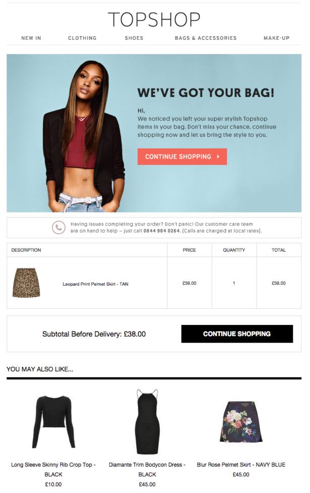
Topshop followed a leisurely 24 hours later.
The good:
Good use of email subject line, ‘Forgotten something? We’ve saved your shopping bag!’ The ‘forgotten something?’ question grabs the attention and the ‘we’ve saved your shopping bag’ puts customer convenience at the fore.
Great call-to-action buttons, good use of space, my abandoned products are listed with prices and subtotal and I quite enjoyed the copy ‘we’ve noticed you’ve left your super stylish items in your bag’ with a touch of urgency ‘don’t miss your chance’.
There are also recommendations for other items that I may like, something that’s missing from the other emails.
The could-do-better:
Both of call-to-actions that say ‘continue shopping’ just go straight to the homepage, rather then to my basket. Then when I arrive at the homepage, my basket is empty. This is a cardinal sin for abandonment emails. At least the Currys email took me to a relevant product page.
Product page links to my item are not at all obvious. Both the image of the skirt and the non-underlined text description are in fact links. The image clicks through to the product, however the text links to a ‘Not Found’ page.
The creative is entirely let down by a poor customer experience.
To learn more about ecommerce and all things digital come to our Festival of Marketing event in November. A two day celebration of the modern marketing industry, featuring speakers from brands including LEGO, Tesco, Barclays, FT.com and more.




No Comments