On a recent post reviewing user experience on hotel websites, one commenter observed that airline sites were much more task focused than their hotel counterparts, despite both being in the same industry.
I do think that travel sites, hotel or airlines, should be focusing on the main user goals when they arrive at the homepage, which is normally encouraging them to search for the product in question.
To this end, a clear and prominent search tool is needed, with a minimum of distractions from it.
While there is an obvious temptation to cram lots onto a homepage, resisting this urge helps more users to start their search.
I’ve been looking at some airline and hotel chain sites to see how they approach this issue.
Airline sites
Searching for suitable flights is the main goal for the majority of visitors, more so for first time users.
The main goal should be to get users searching as quickly as possible, so sites should make the search tool visible and easy to use.
At the same time though, exisiting users should also be catered for, so clear links to areas like flight status and online check in are also important.
Also, in the search box, features like autocomplete and flexible date options help the searcher.
American Airlines
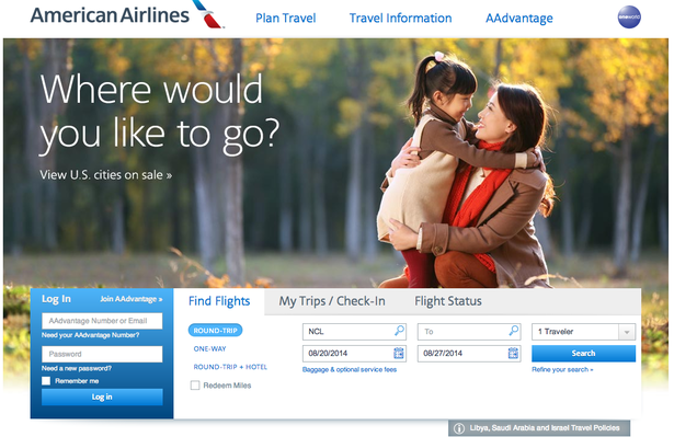
This homepage is nice and simple. Though the search box is further down the page than on some sites, the rest of the page doesn’t draw attention away from it.
Delta
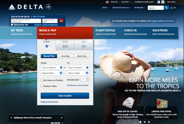
Delta’s homepage highlights the search tool with the help of the red bar, while still leaving other user tasks (flight status, checking in etc) easy to find.
The flexible date option is very useful for those searchers who may not need specific dates, but want to know what’s available over a certain period.
JetBlue
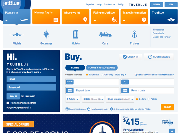
Another good example from JetBlue, thought it has chosen to make the login box more prominent than the others.
Southwest
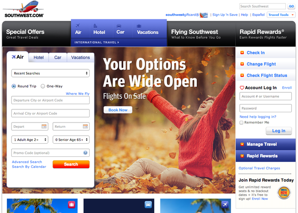
This is a busier page than the others, though the flight search box is still very prominent.
I wonder why Southwest has bothered with the ‘book now’ link on the photo when users can just search right away on the left.
It’s interesting to see the promo code box there. It’s a potential distraction as users without codes may just head for Google to see if they can find one.
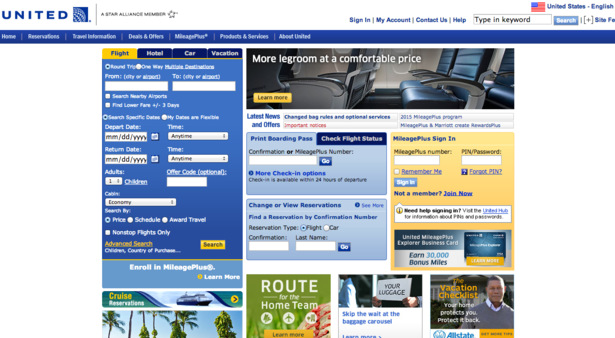
United
This page uses smaller fonts and elements and attempts to cram much more onto the page, even adverts for home insurance.
As a result, it isn’t as clean as some of the other examples here, and individual elements are harder to find.
Hotel sites
Like airlines, the main purpose of most users’ visits to hotel sites is to check room availability and prices.
For this reason, it’s best to focus design on helping customers to achieve this quickly and easily.
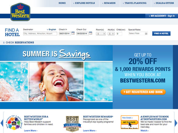
Best Western
The search tool, though prominently placed at the top of the page, does blend into the background and is not the most visible item on the page.
As with airlines, tools which allow flexibility over dates can be useful.
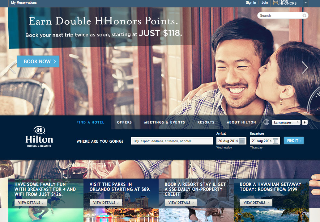
Hilton
The Hilton homepage is a nice clean design but the search box can be less visible with some background images.
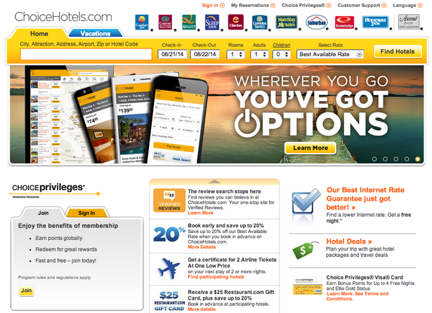
Choice Hotels
This one is a case of find the search box. It could hardly be less visible. Choice seems to be more interested in promoting sister brands, mobile apps and loyalty schemes than getting people to search.
AmericInn
This is a better example from AmericInn. The search box is clearly defined with background colours and calls to action.
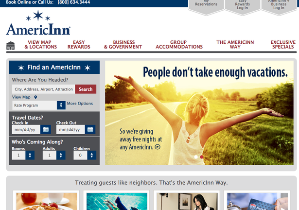
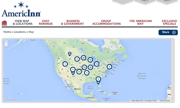
The map option in the search box is a nice touch too, offering users an alternative way to search.
Hampton
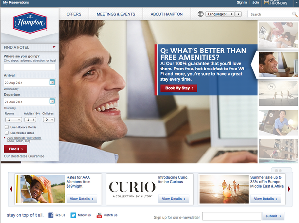
Here, the search tool is pushed to one side by the changing hero image, which doesn’t actually add much to the page.
On the more positive side, this is the only hotel here to offer a flexible date option.
In summary
Most of the sites here make the search box reasonably prominent, but often choose to cram in as many other features as they can.
Though some features are essential, too many can just distract from the main goal of getting as many users into the search and buying process as possible.
Of course, different designs should be tested to see what effect these changes have, but he approaches I like here are those from American Airlines and Delta, while AmericInn seems to be the best of the hotel sites.


No Comments