Site search remains a problem for ecommerce sites, with lack of key functionality and flexibility proving to be a barrier to the user experience.
A new study covered on the excellent Smashing Magazine website looks into some of the major problems with site search in the US.
Here, I’ll look at some of the issues mentioned in the study, along with my own observations on the state of site search…
Why is site search important?
People who use site search are more likely to purchase compared to those who use standard navigation.
Why are those who use site search more likely to purchase?
- They have buying intent. These visitors know what they want and are on a mission to find it. You need to get out of their way, keep all the distractions off to one side. Just make it easy for them.
- They are in late stage buying mode. Information gathering is completed, and they want to view product content to satisfy other buying motivators such as price, is the product in stock, and freight charges.
- They are loyal. If they have intent and land on your homepage, they have your website bookmarked, may have purchased from you in the past and want to take the path to least resistance.
- They have come as a result of a campaign. Regardless of campaign type, they have found your site and are attempting to find something specific.
The search box (assuming they have one) comes with the expectation of delivering relevant results, and consequently promotes the search option as a preferred choice. The expected result is a frictionless journey to a product detail page.
Retailers dissatisfied with site search tech
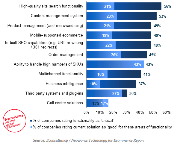
Our recent Ecommerce Platforms Buyer’s Guide found that, though high quality site search functionality was rated as critical by 56% of companies, just 21% rated their current solution as good.
Site search is a crucial part of any ecommerce site, but too many sites have failed to up their game here, or are using ecommerce platforms which don’t meet their needs.
Ecommerce platforms: criticality of functionality versus performance:

Issues with site search in ecommerce
No site search at all
Yes, it still happens. Imagine customers arriving at your site with a specific product in mind? This presumably didn’t occur to the folks at H&M.
H&M was late to ecommerce, and initially launched a very poor site in 2010, which it improved back in 2011.
Since then, it still hasn’t added site search functionality.

Not allowing searches by product name or model number
16% of the US sites studied by Baynard didn’t support these searches, though these details do appear on product pages.
This is basic best practice, and will just lead to unnecessary abandonment as customers assume that no results means that these products aren’t in stock.
Not dealing with simple misspellings
18% of sites returned no results when a single character was wrong in a product’s name. Again, this will just irritate users who are potentially in purchase mode.
At the very least, retailers should study their site search data to identify common misspellings and optimise results for those terms.
Here, PC World ignores my typo and shows relevant results anyway. This is the way to do it.

Failing to cater for alternative product terms
70% of sites require users to search by the exact jargon for the product type that the website uses.
Sites should cater for synonyms and deal in the language that customers use, not that which their merchandising team or supplier prefers.
Again, site search data can be used to solve this problem. The added benefit is that the terms used in site search are also those that potential customers are likely to enter into Google.
Optimising for both is a very good idea.
Not leaving the search query in place on the results page
Users often like to refine the search query they initially entered, adding or removing words depending on the results returned.
Despite the fact that 65% of all Baynard’s test subjects’ attempts at searching consisted of two or more queries in the same search, only 34% of ecommerce sites pre-filled the query in the search field on the results page.

No faceted search
This is an essential feature of site search and navigation in general, as it allows users to narrow down the product set from their initial search.
Customers need to filter by product features and characteristics to narrow down results, but 40% of retailers don’t have this option.
Here, a search for sofas on Ikea produces 300 results. While it’s useful to filter by colour and price, I could really do with options such as sofa size, material, style etc.

Here’s a better example from sofa.com. Searcher can refine by size, fabric, style, and even ‘Rohan’s mad filters’ – a nice touch.

Which sites are providing excellent site search?
This is the top ten according to the study:
- Amazon
- Walmart
- Newegg
- Wayfair
- Sears
- Walgreens
- Lowe’s
- Office Depot
- Shoebuy.com
- Build.com
And here’s why…
You’re not going to catch Amazon out with a simple misspelling:

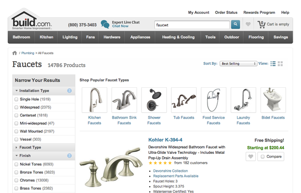
Build.com shows how to deal with a misspelling. Also note the faceted search options and the fact that my original search term is pre-filled on the results page.


No Comments