Advertise here with BSA
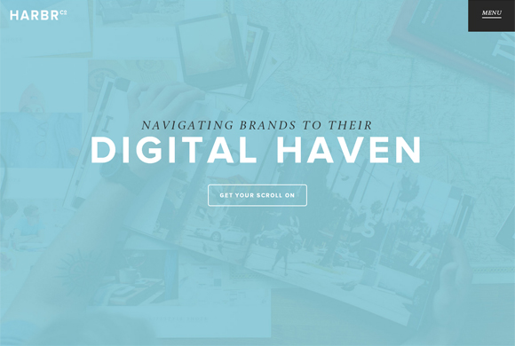
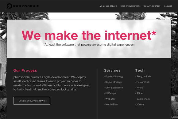
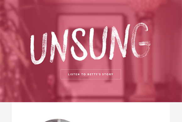
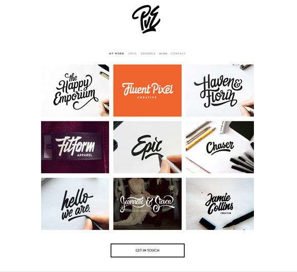
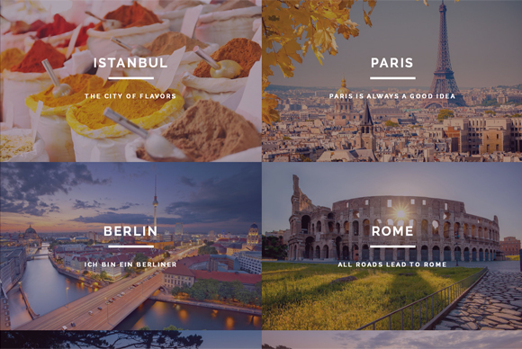
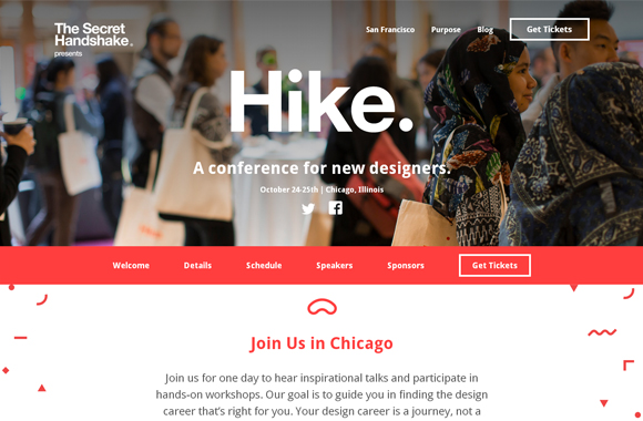
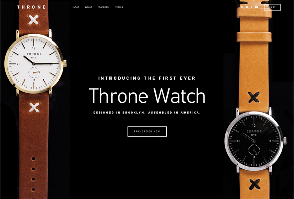
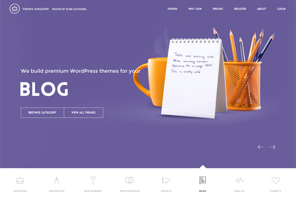
Although the first half of 2014 has gone by, today we can see new design trends that appeared in web design this year. “Ghost buttons” are those transparent, empty buttons that have basic button shape, but are bordered by a thin line. Some of these ghost buttons could be interactive, – while click over it, the button may become non-transparent, but white or some other color highlighting with the background. As a rule, designers use sans-serif light fonts for wording.
These kind of buttons are called ‘ghost’ due to their transparent nature. They’re transparent as ghosts, at the same time they grab users’ gaze at once and do not overload design. You may find ghost buttons on a wide variety of sites. The best ghost buttons look on websites with large-scale background, and flat, minimalist design. Scroll down to see 25 awe-inspiring websites using ghost buttons I put together below.
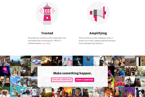
Indiegogo
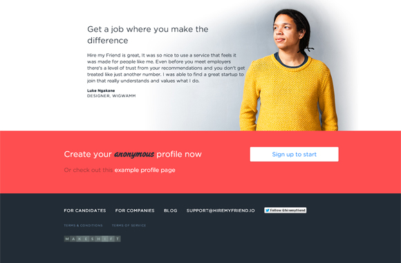
Hire My Friend
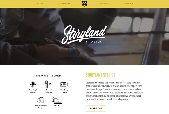
Sputnik
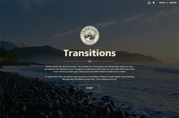
Transitions
Harbr Co
Go Philosophie
Unsung
Paul von Excite
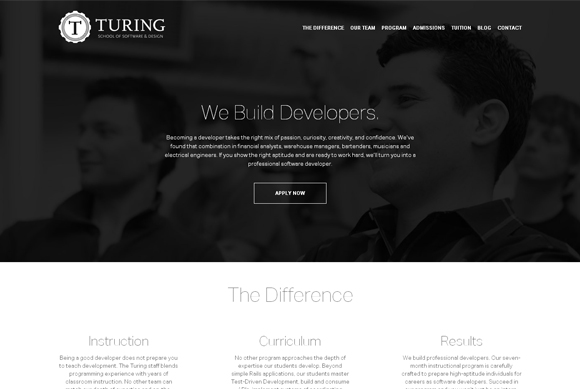
Turing
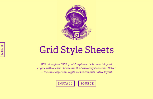
Grid Style Sheets
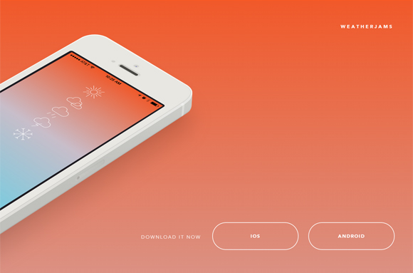
Weather Jams
Ben Challand
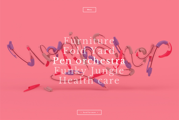
Assembly

Degordian
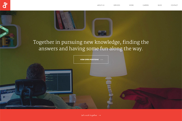
World in My Lens
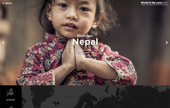
The Web Is
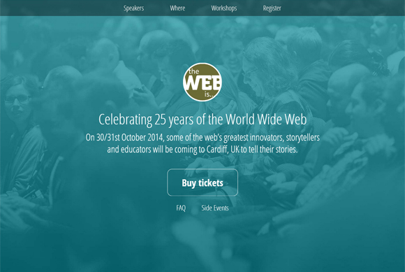
Standin
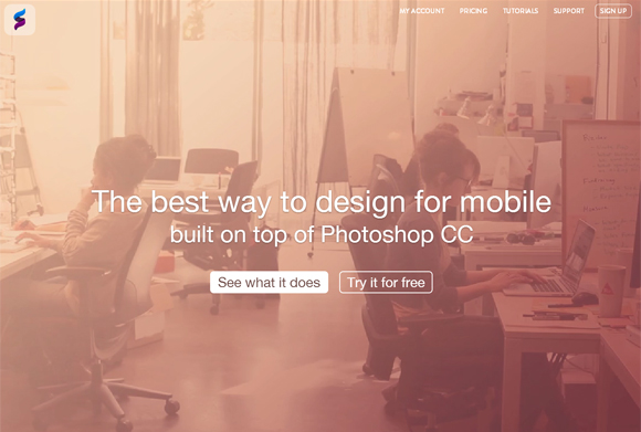
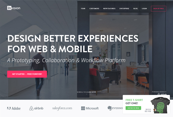
Invision App
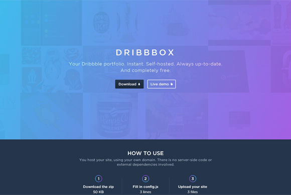
dribbbox
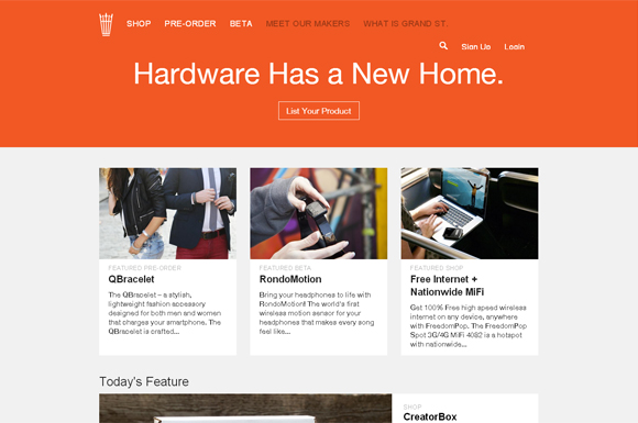
Grandst
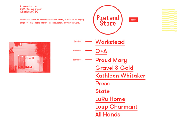
The Pretend Store
Triplagent
Hike.
Throne
Themes Kingdom





No Comments