Everything about having a background video seems to go against the basic rules of web usability.
It means the page might take longer to load, or the user might become distracted, and surely nobody thinks autoplay music is a good idea.
That may all be true, or it may not, I haven’t been able to find any stats to support either side of the argument.
What’s certainly true is that these moving images captivate the user and ensure the website stands out from the standard cookie-cutter formats we’re used to seeing.
I’ve rounded up 20 of these spectacular websites, many of which are also good examples of the trend towards using scrolling as a design feature.
If you have any thoughts on whether a background video is a good idea, let me know in the comments.
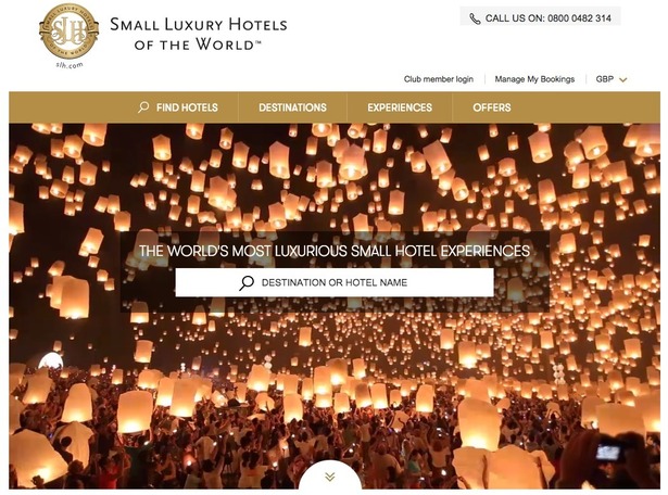
Small Luxury Hotels of the World
A niche website, and I’m not really sure what the lanterns have to do with luxury hotels. But it looks great.

JL Sawyer
This site is to promote A Bloom of Ruins by author JL Sawyer. The movement is very subtle but it works well with the overall aesthetic in my opinion.
GoPro
This is actually a YouTube video, and it took ages to load on my computer, but it’s still worth checking out.
Marmoset Music
Harvey Vice
Nike Air Jordan
Mood Furniture
Uniqlock
I’m not sure what this Uniqlo website does, but it’s brilliant.
Lois Jeans
Airbnb
APTCB2
D.FY
Bellroy
Provence
Woodland Ad Agency
Adopt Cymru
Negrar
Wayne McGregor Random Dance
This dance studio has a particularly frantic background video, but it creates a very powerful impression.