Finally an excuse to wear your sunglasses around the office.
One of the easiest ways for a website to immediately grab the attention of a visitor is to turn the colour up. Way up.
If you’re of a particularly bold inclination, I for one am hugely attracted to bright solid colours or anything neon, you’ll appreciate it when a site breaks out of the usual whites, greys and blacks of typical ecommerce design.
It separates you from the crowd. It’s a statement of independence. It’s a statement of rebellion. Sure not everyone will dig your new hypercoloured threads, but just remember that the squares can keep their greys… You’ve gone Technicolor.
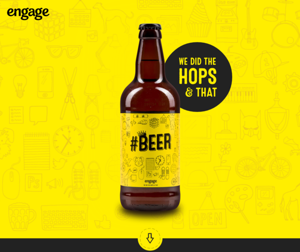
#Beer
Hard to miss collaboration between Engage and Revolutions, which also has a neat little spin the bottle touch.
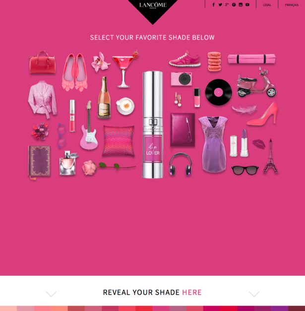
Lancome
Pink. So much pink. It’s glorious, and the site itself is a scrolling, interactive winner.
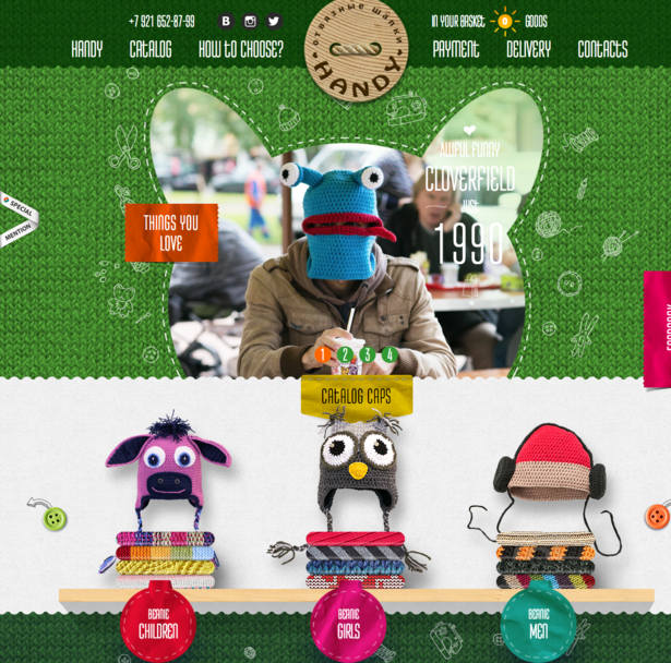
Handy Hat
There’s so much going on here, but all of it is completely charming and filled with wonder.
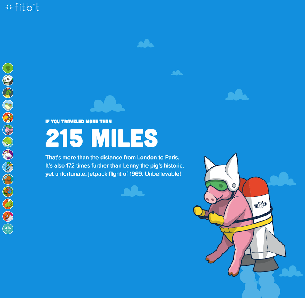
Fitbit
Fitbit has a brilliant scrolling, subtly-animated lead-in to its ecommerce site which reveals equally colourful product pages.
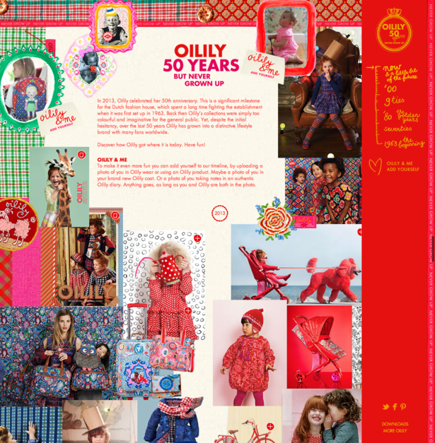
Oilily
This is a fantastic scrolling website showcasing the history of the Dutch fashion brand.
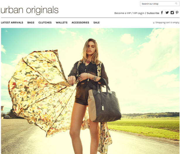
Urban Originals
Incredibly large bright images completely dominate the homepage and make for an arresting welcome.
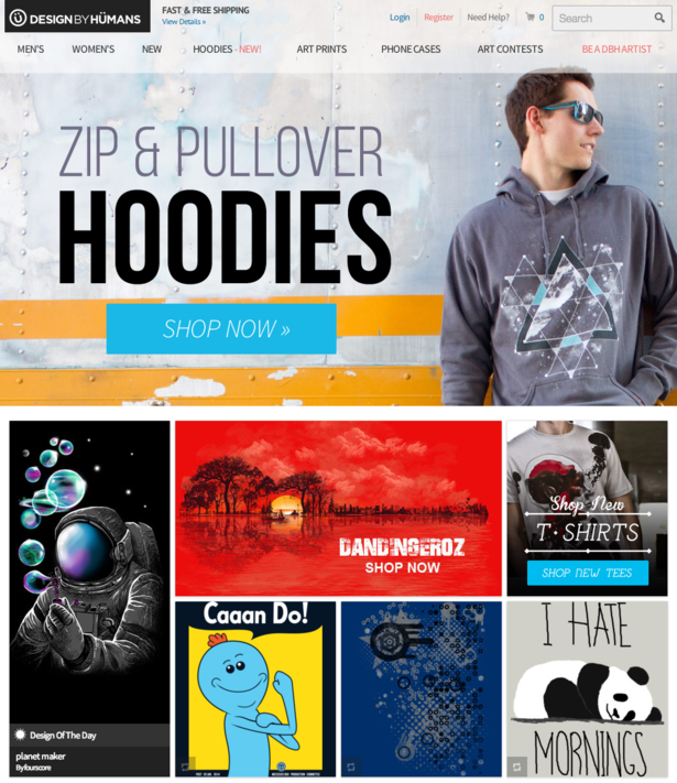
Design By Humans
It’s very easy to constantly highlight Threadless and its fantastic looking ecommerce store, so let’s give another t-shirt brand a go. Welcome to the blog Design By Humans!
Von Dutch
Step out of Von Dutch’s way, or else prepare to be smacked in the face with orange.

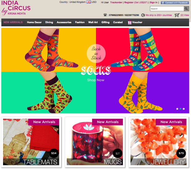
India Circus
The homepage is gorgeous but frankly every product page here is a feast of colour.
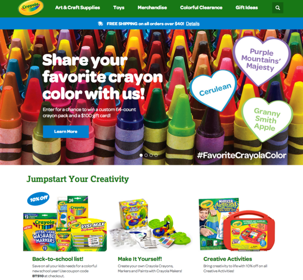
 Crayola
Bit of a no-brainer this one.
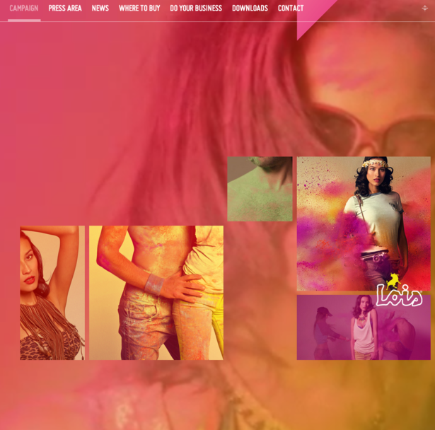
Lois Jeans
Scores for both brightness and overlarge background video.
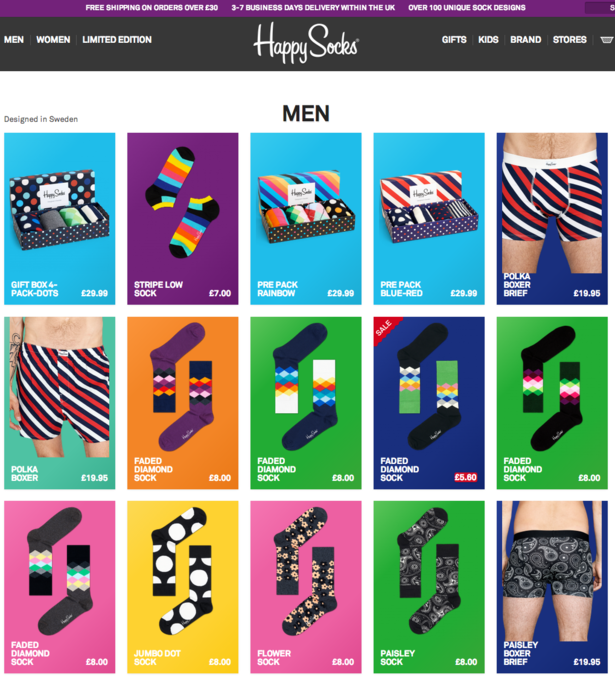
Happy Socks
Boldness! Flat design! Socks!
For more on web design from the blog, check out these 16 examples of flat ecommerce design and 20 beautifully persuasive ecommerce designs.


 Crayola










No Comments